Mobile first indexing is one of the hot topics in 2023, and it’s been rather important since 2019. However, we see far too many site owners and enterprises ignoring key changes Google has made to their mobile first index in recent years.
But in today’s article, we’re going to explain what mobile first indexing is, how it works and best practices for you to master Google mobile SEO.
Contents
What is Mobile First Indexing?
Google mobile SEO is more important than ever before. Why? Google uses, in the majority of cases, a site’s mobile version for:
- Indexing
- Ranking
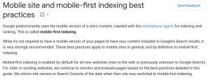
Googlebot, the bot responsible for mobile-first indexing on Google, has been updated to know that most users accessing Google Search are on mobile devices. Over 90% of people online access the Internet on a mobile device.
While this figure doesn’t mean that everyone or even just 10% of people perform searches on desktop, it does mean that you need to shift your focus from desktop to mobile optimization.
How Google’s Mobile First Index Works
Google’s inner workings will always be a “mystery.” Experts can speculate and piece things together to better understand what’s happening “under the hood,” but there always seems to be something we miss.
However, Google has been rather upfront and honest about its mobile first index.
A few things that we know for sure are:
- Google crawls your site
- Mobile versions of the site are indexed and ranked
- Desktop versions are ignored for most sites
- Google displays mobile/desktop URLs, if they’re separate, to users based on the device they’re using
- Websites should have the same experience for mobile and desktop users
Thankfully, Google mobile SEO best practices are no secret, and the company outlines all of its recommendations to site owners and optimization experts.
However, before we go into these best practices, we think it’s essential to know a few tools that can help you test mobile on your site.
Tools for Testing Your Mobile Site
Mobile first is by design, and while you need to continually work on offering the best experience possible to mobile and desktop users, a few tools can help speed up the process. We recommend numerous tools, including:
- Mobile-friendly Test by Google
- PageSpeed Insights by Google
- HubSpot Website Grader
Once you have all of the tools you need, it’s time to move into the best practices to follow recommendations directly from Google.
7 Best Practices to Master Google Mobile SEO
1. Check the Crawlability of Your Mobile Site
First and foremost, ensure that Googlebot can crawl your site. You can open up the URL Inspection tool on Google Search Console to see if the page is mobile friendly. Simply:
- Go to Google Search Console
- Click URL Inspection
- Type in the URL
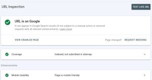
If your page is mobile friendly, you can go to the next steps. A few additional pointers from Google here are:
- Mobile and desktop pages should have the same meta robots tags. This means the same nofollow and noindex tags on both versions of the site.
- Drop lazy-loading for primary data. If the content requires some form of user interaction to load, Google won’t load it, leading to poor rankings.
- Ensure you aren’t blocking URLs due to a disallow directive being overlooked.
Once you know that your page(s) can be crawled and indexed correctly and aren’t causing any issues, such as using different meta robot tags, it’s time to move on to your site’s content.
2. Make Desktop and Mobile Content the Same
Since Google is going to focus on the mobile version of your site, you want the same content across both the mobile and desktop versions of your site. Unfortunately, a mistake that some experts make is that they try to make the mobile version of their site smaller.
Why?
There was a time when mobile data was slow and the focus was on loading time. Yes, you still need to focus on site loading speeds, but mobile devices can handle all of the pages on your site.
Google also has a warning for you on having less content on your mobile site:
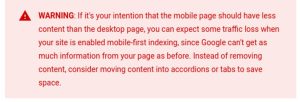
Google even recommends updating your site to display the same content on your desktop and mobile site or risk losing some of your rankings in the process. Since the mobile first index takes precedence over desktop versions, it’s more crucial than ever to have the same content across every version of your site.
3. Use Structured Data on Mobile
Mobile should have the same structured data as a desktop site. One thing to note is that if you have to prioritize the type of structured data you use, Google recommends:
- Breadcrumb
- Product
- VideoObject
We recommend learning and using Data Highlighter to try and help Google understand the data on your site. If you haven’t used this tool before, watch this introduction below:
Introduction to Data Highlighter
Next, it’s time to move on from your structured data and focus on your metadata for mobile first indexing.
4. Duplicate Metadata on Both Site Versions
Metadata on both sites should be the same. If you have a different meta title or description on one version of your site than another, this can cause optimization issues. Go through your site and ensure that the mobile and desktop versions both have the same metadata.
5. Ads Impact Mobile Rankings
One area of optimization that differs greatly on desktop and mobile is ads. Mobile screens are smaller than desktop screens, and don’t want large ads above the fold taking up too much of the mobile screen’s space.
If the ad causes visitors to scroll down the screen too much, it leads to:
- Bad user experience
- Lower rankings
Instead, it’s crucial for you to familiarize yourself with the Better Ads Standard
6. Optimize Your Visual Content
Visual content should be optimized for mobile, and a few of the tips that go a long way here are:
- Use high-quality images that are clear and easy to see
- Be mindful of image formats that may not work on mobile
- Don’t use dynamic image names that change with each page load
- Use the same alt tags on all site versions
If image traffic is important for your site, you’ll want to follow the practices above, including optimizing captions, titles, text and filenames.
Note on video: Video can follow all of the same recommendations as above, but you’ll also want to make it as easy as possible for the user to watch important videos on your site.
7. Follow Separate URL Best Practices
If your site already has separate URLs for the desktop and mobile versions of your site, you’ll want to follow these practices:
- Check both versions of your pages for errors because an error on mobile/desktop will cause the other page not to be indexed
- Remove fragment URLs from the mobile version
- Verify on Search Console that both versions of the page are being indexed
- Use hreflang to link mobile and desktop page versions
We recommend keeping the URLs the same to avoid working overtime on optimization efforts.
Google mobile SEO, besides these few best practices, will be the same as on your desktop site. However, if you want to learn a little more about the mobile first index, read through the FAQs below.
Mobile First Indexing FAQs
When did mobile-first indexing start?
Google worked on the mobile first index for quite some time before making it the new standard, but it didn’t become the defacto until July 1, 2019. Somewhere towards the end of 2017, Google did start to roll the feature out slowly.
What is mobile first indexing?
Mobile first indexing is a change Google made to their search index that uses a site’s mobile version for indexation and rankings.
Is Mobile First Indexing Enabled on All Websites?
Yes and no. Google decided that there were a lot of great websites for desktops that they didn’t want to fall to the wayside because of the mobile first index. So, the following sites all follow the mobile index by default:
- New sites
- Sites that weren’t in Google’s index but are being found
If you go into your Google Search Console, you can see whether your site switched to mobile first indexing.
Final Thoughts
Mobile first indexing is here to stay. Google follows trends, and unless every ditches their mobile devices and goes back to desktops for searching Google, you can expect the mobile first index to remain a mainstay in search engine optimization.
Google mobile SEO is more crucial than ever before, and if you follow the best practices above, you’re on the right track to mastering the mobile first mindset.